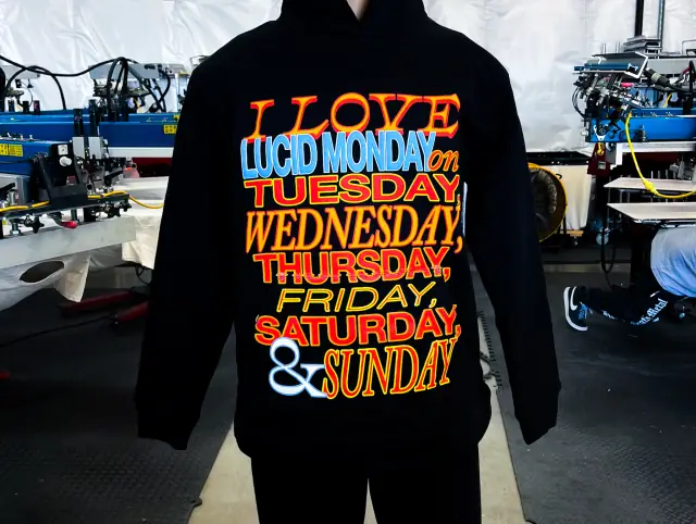
Spot color: one ink, one screen
In spot color printing, every color in the design is its own ink, mixed to match a reference such as a Pantone number, and printed through its own screen. A three-color logo means three inks and three screens, plus a white underbase if the shirt is dark. Edges are crisp, colors are solid, and the ink can be matched closely to a brand standard.
Spot color is the right approach for logos, type, flat illustration, badges and most band and brand graphics. It is also the most forgiving on press, because solid shapes tolerate small shifts in pressure and registration that would ruin a photo.
Spot color does not have to mean flat. A single ink can carry shading through a halftone, so a one-color design can still show a gradient or a photo-like portrait. Many great two- and three-color prints lean on this: a black, a mid-grey made of black dots, and the shirt color showing through.
Halftones and LPI in plain English
A screen either lets ink through or it does not. To print a lighter shade of an ink, the art is converted to dots: small dots for a light tint, large dots for a heavy tone. From arm's length the eye blends them into continuous shading.
Two settings control a halftone:
- LPI (lines per inch) is how many rows of dots fit in an inch. A higher LPI means smaller, finer dots. Garment printing uses a coarse LPI, commonly somewhere in the 35–65 range with 45–55 a frequent middle ground, because fabric soaks up and spreads ink. Printing on paper commonly runs at well over twice that.
- Angle is the direction the rows run. A bad angle fights the weave of the mesh and causes moiré, a wavy interference pattern across the print.
The halftone also has to suit the screen. A common rule of thumb is a mesh count around four to five times the LPI, so a 45 LPI halftone sits on roughly a 180–230 mesh. Too coarse a mesh and the smallest dots fall through the gaps; too fine and the heavy tones lose ink. Dots also grow as they print (dot gain), so separators trim the darkest and lightest values to keep shadows from filling in and highlights from vanishing. How mesh affects this is covered in mesh count and print feel.
Four-color process (CMYK)
Four-color process is the screen printing version of how magazines print. The art is split into cyan, magenta, yellow and black, each as a halftone, and each printed in a transparent process ink. Where the dots overlap, they mix optically into the full range of colors. Each color's dots run at a different angle so the four patterns do not interfere.
Process printing works because the ink is transparent and a white surface underneath reflects light back through it. On a white or very light shirt that works well and uses only four screens for a full-color image. On a dark shirt the system breaks down: the garment absorbs the light, so the print needs an underbase and highlight white, and colors still tend to look dirty.
It is also demanding. Fine dots need finer mesh, tight screens and precise registration, and process inks cannot hit a brand's exact Pantone color, because every color is a blend. Some jobs add one or two spot colors to the four process screens to fix a critical logo color.
Simulated process
Simulated process borrows the halftone idea but swaps transparent process inks for opaque spot inks. A separator studies the image and builds a set of channels, typically a white underbase, a handful of colors drawn from the artwork (a red, a skin tone, a blue, a gold, a black) and often a final highlight white. Each channel is a halftone, so the colors blend where their dots sit side by side.
Because the inks are opaque and printed over white, simulated process looks rich and bright on dark garments, which is where it shines. The black of the shirt can even serve as the shadow color, saving a screen. Many separators run every halftone in a simulated job at the same angle, commonly around 22.5 degrees, to stay clear of moiré against the mesh.
Index separation is a close relative. It converts the image to square dots of one size scattered in a random pattern, rather than dots that change size. Index can look grainy up close, but it sidesteps moiré and handles some art better, at the cost of more colors.
Simulated process is the usual route for photo-real band art, painted illustration, detailed pet portraits and anything with soft gradients on dark shirts.
The three side by side
| Spot color | Four-color process | Simulated process | |
|---|---|---|---|
| Art it suits | Logos, type, flat illustration | Photos and full-color art | Photos, painted or highly detailed illustration |
| Garment color | Any | White or very light | Dark or light; built for darks |
| Inks | Opaque spot inks matched to references | Transparent cyan, magenta, yellow and black | Opaque spot inks plus a white base |
| Screens | One per color, plus any underbase | Four, sometimes plus a spot color | Several, often six or more including whites |
| Halftones | Optional, for tints and shading | Throughout | Throughout |
| Color matching | Close match to a brand reference | Approximate; every color is a blend | Close to the art, not exact to a swatch |
| Main cost driver | Number of colors | Prepress and press precision | Separation work and screen count |
How the garment changes the result
The shirt is part of every separation. On a white tee, white areas of the art can simply be left unprinted, and light tints come from small dots with fabric showing between them. On a black tee the opposite holds: anything bright needs white ink under it, and the darkest parts of the image can be left open so the shirt itself becomes the shadow. A mid-tone garment such as heather grey, navy or a forest green is the hardest case, because it is neither a clean light nor a clean dark, and separators often build a custom set of inks for it.
Fabric texture matters too. Halftones hold best on smooth, tightly knit ring-spun cotton, where small dots land cleanly. Open knits, fleece and heavily textured blanks swallow fine dots, so the separator may drop the LPI or simplify gradients. If a design will print on several garment colors, expect separate separations, and sometimes separate screens, for each one.
Choosing by artwork and shirt color
- Logo or type on any shirt: spot color. If the logo has a gradient, add a halftone to one of the inks rather than switching systems.
- Photo on a white shirt: four-color process is efficient; simulated process also works and usually hits brighter colors.
- Photo or painted art on a dark shirt: simulated process.
- Very small run of full-color art: neither may be worth the screens. DTG prints full color with no separations at all, and screen printing vs DTG explains where the line falls.
- Vintage, distressed look: spot color with halftones, printed in water-based or discharge ink, gives that worn, soft photo look with few screens.
Cost logic: screens and separations
Screen count drives setup in all three systems, so a four-color process job and a four-color spot job carry similar screen costs. The differences come from the work around the screens. Spot separations of clean vector art are quick. Process jobs need careful calibration and fine mesh. Simulated process needs a skilled separator to build the channels, and that time is often quoted separately from printing. The finer halftones also make setup and registration slower. What drives screen printing cost has the full picture, including ways to drop colors without losing the look.
Sending art for each approach
For spot color, vector files with named colors are ideal. For process or simulated process, send the highest-resolution raster file you have, built at the final print size with layers intact, and say which garment color it will print on, since separations for a black shirt differ from those for a white one. File prep, resolution and what a printer sends back for approval are covered in preparing artwork for screen printing.
Sources
- ScreenPrinting.com, What mesh count should I use for halftones, checked 2026-10-04
Useful for: bands, clothing brands, creators.