How placement is measured
Placement is described by two numbers: how far the print sits from a fixed point on the garment, and how big it is. On the front, the usual reference is the collar seam at center front, where the neck ribbing meets the body. A spec such as "3 inches down" means the top edge of the artwork sits 3 inches below that seam. On the back, it is the collar seam at center back. Some brands and factories measure from the high point of the shoulder (HPS), where the shoulder seam meets the collar, so check which reference a spec sheet uses.
Width is the measurement that matters most. A print's height follows from the shape of the art, but its width decides whether it fits the chest, how it looks across sizes and whether it fits the press. Always measure the garment flat and on center, and give sizes in inches to one decimal place on your spec sheet.
Standard placements and sizes
These are typical starting points for an adult unisex tee around size medium or large, drawn from common industry practice. Real garments and designs vary, so treat them as defaults to adjust.
| Placement | Typical width | Where it sits |
|---|---|---|
| Left chest | 3–4 inches (about 4.5 maximum) | Top roughly 2.5–4 inches below the collar seam; centered about midway between the center line and the armhole, on the wearer's left |
| Center chest | 8–10 inches, 4–6 inches tall | Top edge about 2.5–3 inches under the collar seam |
| Full front | 10–12 inches | Top about 3 inches below the collar, range 2–4 |
| Oversized front | 12 inches and up | Starts at a similar height; see jumbo prints |
| Back neck (locker patch) | 2.5–3 inches | 1–2 inches below the back collar seam |
| Upper back or yoke | 10–12 inches wide, a few inches tall | About 2–4 inches below the back collar |
| Full back | 12–14 inches, up to about 16 tall | Top 3–4 inches below the back collar |
| Short sleeve | Commonly 2.5–3.5 inches | Centered on the sleeve, about an inch above the hem |
| Long sleeve run | 1–2 inches tall, up to about 14 long | Running up the arm from a few inches above the cuff |
| Inside neck label | 2–3 inches | Centered below the inside back collar seam |
A few notes on the common ones:
- Left chest is the corporate and staff-shirt default, and it pairs well with a large back print. Keep it simple: at 3.5 inches wide, fine text and thin lines disappear.
- Full front is the merch staple. Ten to twelve inches wide fills an adult chest without wrapping toward the sides. Square art often looks best at the smaller end; wide wordmarks can use the full width with little height.
- Full back can run a little wider and taller than the front because the back panel is flatter and uninterrupted.
- Prints that go big past the standard area are covered in jumbo and oversized prints, and sleeves, hoods and pockets in printing on sleeves, hoods, pockets and zippers.
One print size across a size run
Most screen printed orders print one size of artwork on every shirt in the run, because each extra size of the same art needs its own screen and setup. That works if the print suits both ends of the size run. Check the brand's size chart: if the smallest size measures 18 inches across the chest flat, a 12-inch print leaves just 3 inches on each side, and the design will reach toward the armholes and side seams. On a 3XL the same print can look small and sit too high.
Common fixes:
- Size for the middle and test the extremes. Put a paper printout of the art on the smallest and largest shirts in the order before approving.
- Use two print sizes. A reduced version for the smallest sizes, or a separate youth size, means an extra screen but much better proportions. This is a simple form of grading the artwork.
- Shift placement, not size. Printing slightly lower on the biggest sizes and slightly higher on the smallest keeps the art where the chest is.
- Split the order by fit. If a run includes youth, adult and fitted cuts, quote them as separate placements from the start.
Youth, fitted, oversized and hoodie cuts
Youth shirts need smaller art: full fronts commonly land around 8–10 inches wide, placed a little closer to the collar, around 2–2.5 inches down. Fitted and women's cuts are narrower through the chest and shorter; full fronts often sit slightly higher and narrower than on the unisex version, and a design printed at unisex width can distort over the bust.
Boxy and oversized fits are the opposite: wider bodies and dropped shoulders can carry larger prints, but the collar-to-print distance should still look intentional rather than sagging. Boxy, oversized and streetwear fits explains how the cut changes placement.
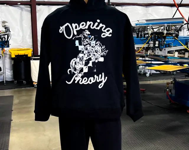
Hoodies have a kangaroo pocket that sets a hard limit on front print height, so measure from the neckline to the top of the pocket and keep the art inside that space. Pullover hoodies can also take a print across the pocket with care; zip hoodies split a front print in two or move it to the left chest. On the back, the hood drapes over the top few inches, so a hoodie back print usually starts noticeably lower than the same print on a tee. Hood prints and sleeve hits need dedicated fixtures. How to choose a blank hoodie covers pocket and hood construction.
Crewnecks, long sleeves, tanks and polos
Crewneck sweatshirts take the same placements as a tee, but the ribbed waistband and heavier fleece shorten the usable front, and a full front often sits a touch higher. Long-sleeve tees add the sleeve run as an option, a narrow print running up the forearm, which needs a sleeve fixture and art that reads well rotated. Tank tops have deep armholes and a narrower chest, so full fronts shrink and center chest prints often work better. Polos are usually embroidered on the left chest because the placket and knit texture make large prints awkward; if a polo is printed, keep it to a small chest or upper back mark.
Whatever the garment, check two things before sizing the art: the flat chest width of the smallest size, and anything that interrupts the print area, such as a placket, pocket, seam or zipper.
Checking placement before you approve
Mockups are useful, but a flat digital mockup can mislead on scale. Two quick checks help:
- Print the art at actual size on paper, cut it out, and tape it onto a shirt in the same style and size. Look in a mirror and from across a room.
- Compare with a shirt you own whose print you like. Measure its width and its distance from the collar and use those numbers as your reference.
When the printer sends a mockup and spec sheet, confirm the width in inches and the distance from the collar for each location, not just the picture. On a color- or placement-critical run, a strike-off on the real garment settles it. On press, the shirt is loaded onto a platen and aligned to fixed guides, so the numbers on the spec sheet are what the printer will follow.
Placement mistakes to avoid
- The belly print. A full front placed too low sits on the stomach. When in doubt, go higher.
- Too wide for the smallest size. The print curls toward the armpits and side seams.
- Fine detail at left-chest size. Small type and hairlines that look fine on screen fill in at 3.5 inches. See preparing artwork for screen printing.
- Printing over seams, pockets or zippers by accident. Ridges break up ink coverage. Check the garment's construction against the art.
- Ignoring the garment. The same numbers do not work on a cropped tee, a tank top or a long-line fit. Measure the actual blank, using the method in t-shirt size charts.
- Approving from a photo of a mockup. Approve from measurements.
Sources
- ScreenPrinting.com, T-shirt design placement guide, checked 2026-10-04
Useful for: clothing brands, companies, sports teams, schools and clubs.